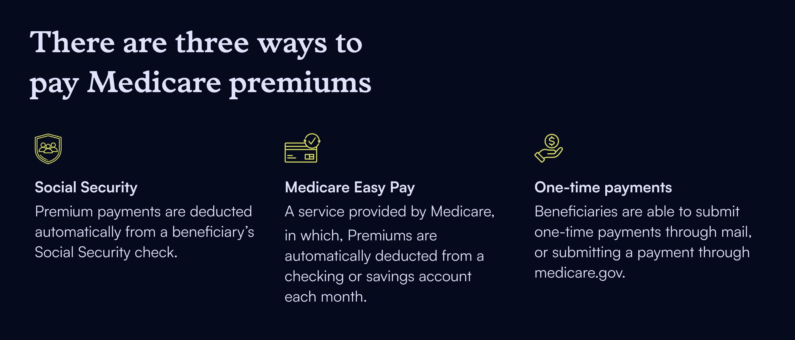
Redesigning How Medicare Beneficiaries Pay For Their Coverage
Medicare beneficiaries often struggle to understand how much they owe, when payments are due, and whether their most recent payments have been processed. Our team set out to redesign the premiums experience on Medicare.gov to make this critical information easier to find, understand, and trust.
DAte
Nov 7, 2025
Category
Service Design
Reading Time
10 Min

About Medicare Premiums
The majority of beneficiaries using the premium payment feature on Medicare.gov are new enrollees. As this is one of the first points of interaction that beneficiaries have with Medicare, it is a critical infrastructure point to build trust.
At the time of analysis, approximately 2.07 million beneficiaries were using the feature. In April 2024, data showed 15,344 beneficiaries clicked “Pay My Premiums” but never completed the flow, resulting in defaults on coverage. This demonstrated how design clarity directly affects coverage continuity and underscored the urgency of improving the experience.
Discovery Phase
Defining the Opportunity Area “When and How Much?”
During the discovery phase, we partnered with CMS’s Division of Research to conduct in-depth interviews with Medicare beneficiaries and review feedback from the Medicare.gov Qualtrics survey.
Across interviews and survey comments, a consistent theme emerged: beneficiaries struggled to locate and interpret essential payment information. Data about premiums, billing, and payments were scattered across multiple pages, requiring users to piece together answers.
“On the home page, or at most one click away, display the following: amount due, date due, and any past due amounts. THESE TWO AMOUNTS ARE LITERALLY LIFE AND DEATH FOR MEDICARE RECIPIENTS.” - Response from survey on Premiums Page.
Evidence from Data Insights
To complement qualitative insights, we collaborated with Erin Thomas, Rebecca Rodriguez, and Mohammad Usman of BlueLabs (now Inroads Advisory) to analyze user behavior in the premiums flow.
We defined three key metrics:
Start a flow: Beneficiary clicks “Pay My Premiums.”
Complete a flow: Reaches “Submit My Payment”
Successful flow: Submits a payment successfully (backend payment received)
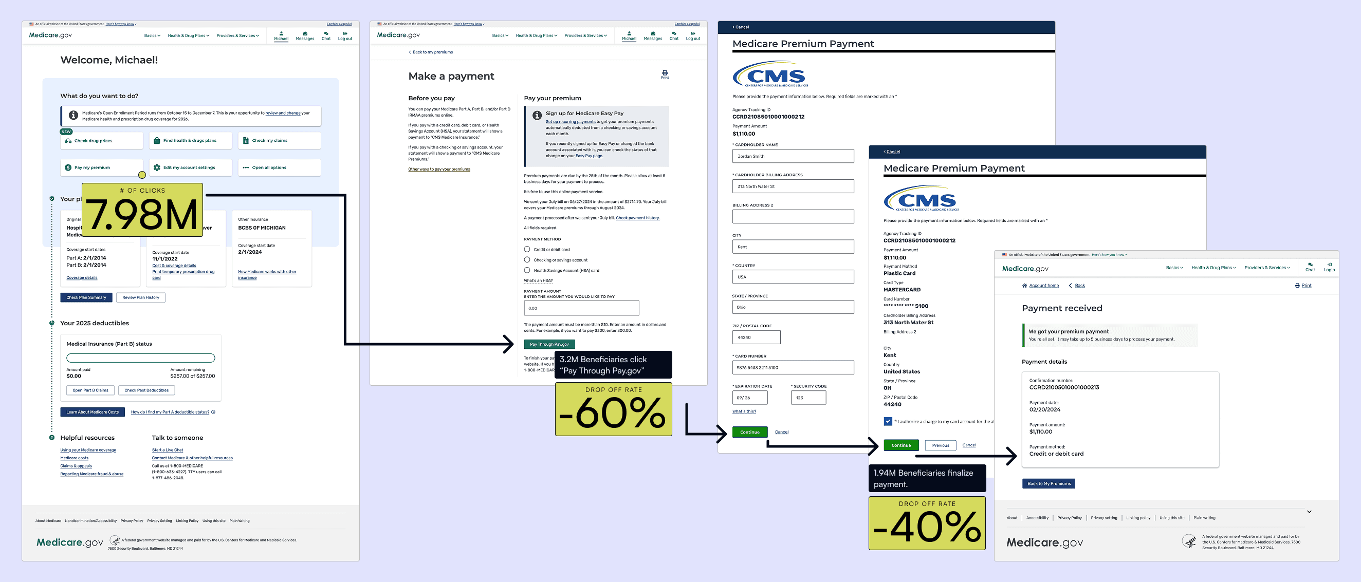
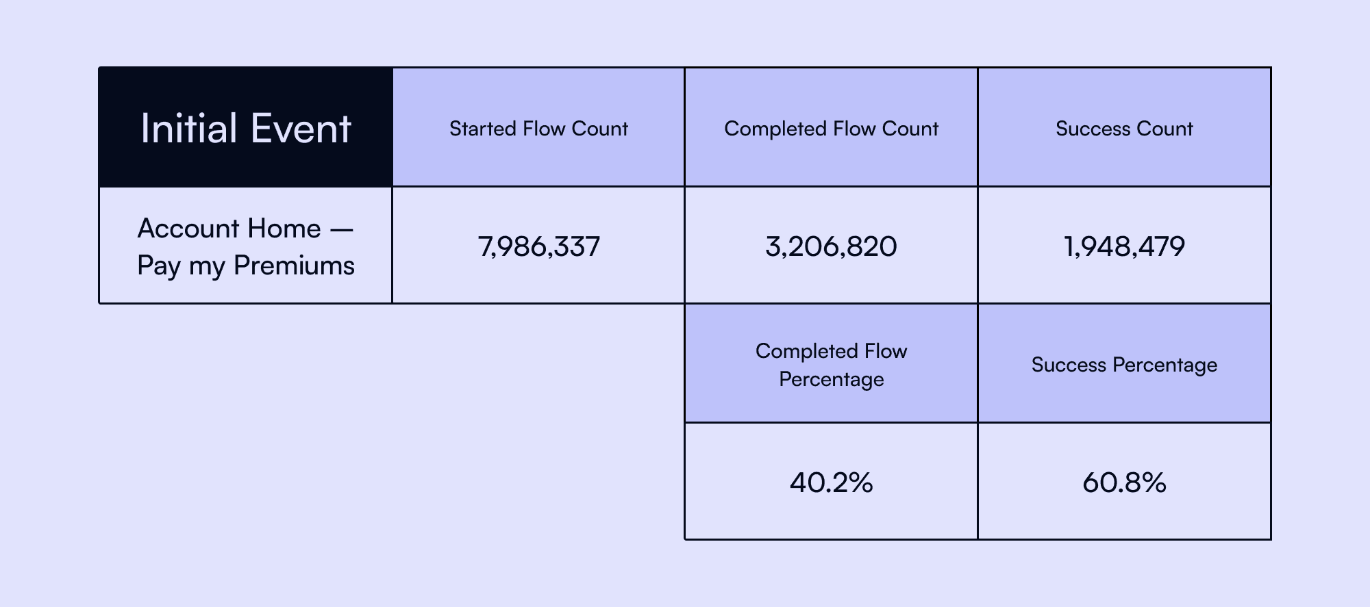
Between June 2023–March 2024, over 8 million beneficiaries began a payment flow, yet only 41% completed it, and 61% of those successfully submitted. Completion rates were far higher when users entered from contextual pages (like Premium Bills or Payment History) rather than Account Home, where they lacked clarity about what they owed.
This confirmed that lack of context, not motivation, was driving drop-offs. Beneficiaries sought reassurance before acting—a key insight that shaped our design strategy.
Synthesizing the Findings
Synthesizing across interviews, surveys, and analytics, the team identified a clear opportunity:
How might we help beneficiaries understand their financial obligations and payment timelines with clarity and confidence.
This framing, which we refer to as "when and how much?" became our north star for the rest of the project.
Design Phase: From Fragmented Pages to a Cohesive Experience
With our opportunity defined, the design team began restructuring the Premiums experience to support clarity, confidence, and continuity. We mapped the existing system, identified points of friction, and tested early prototypes with engineers and CMS stakeholders.
Mapping the Existing Experience
graphic: experience map of original flow
The existing experience spanned multiple disconnected pages—My Premiums, Make a Payment, Premium Bills, My Monthly Premiums, and Payment History. This fragmentation forced users to jump between screens, undermining trust and making payment completion unnecessarily difficult.
Key Content Prioritization
graphic: key content elements visual
We audited all content and identified the minimum set needed to convey when premiums are due and how much is owed. Given our constraint of not building new data capabilities, we focused on reorganizing existing information to improve comprehension.
Understanding Interrupt Events
graphic: diagram showing interrupt events
Behavioral data revealed frequent “interrupts” when beneficiaries were attempting to make a payment. Primary redirects went to the My Premiums and Payment History pages, suggesting users were seeking reassurance before submitting.
We translated this into an early design goal: make the most important information—what’s owed, what’s been paid, and what’s due next—visible within the payment submission page.
Reorganizing Premiums Content
graphic: content reorganization diagrams
To reduce cognitive load, we consolidated six landing pages into three, balancing completeness with simplicity. Our new structure provided contextual entry points and clearer feedback throughout the payment flow.
Adding Clarity to Payment Flows
graphic: current vs. updated payment flow
Post-payment confirmation was a major pain point. Previously, a confirmation banner disappeared after five days, leaving users uncertain about whether a payment had gone through.
We introduced more persistent confirmation states and transparent messaging to ensure users always understood their payment status.
Low-Fidelity Prototyping: Payment Notification Journey Mapping
graphic: diagram of payment journey map
We mapped the path of payment data across data recipients including CMS, Banking Institutions, BEDAP (Beneficiary Experience Data Analytics Platform) and beneficiaries, to understand timing and accuracy.
This helped us design notification logic that avoided confusion when users made payments close to due dates, ensuring success messages weren’t displayed alongside new, unpaid bills.
Low-Fidelity Prototyping & Feasibility Workshops
graphic: early wireframes + workshop snapshots
Wolfe led weekly feasibility workshops with engineers to ensure all designs stayed within scope and technical reality. One early idea—showing how much a beneficiary had already paid—was deprioritized after engineers surfaced data integrity risks. Instead, we focused on clarifying existing data, emphasizing trust and clear communication as the primary design outcomes.
Low-Fidelity Prototyping: Key Information & Status Indication
graphic: early My Premiums wireframe
The redesigned My Premiums page became the central landing point, displaying:
Recent Bill Total
Recent Payment History
Billing History
Option to Enroll in Easy Pay
Payment Submission Path
We also strengthened status indicators using CMS billing states—First Bill, Second Notice, Delinquent Bill—to help beneficiaries immediately understand their coverage status.
High-Fidelity Prototyping
graphic: high-fidelity screens / prototype link
After internal testing and stakeholder validation, we moved into high-fidelity design and prepared prototypes for beneficiary testing.
[Link to prototype]
Research Phase
Research Goals
We partnered with the CMS Division of Research to test comprehension and confidence:
Can beneficiaries understand how much they owe?
Do they recognize when they’ve submitted a payment?
Can they see whether they still have a balance?
Do they understand billing cadence and coverage periods?
Can they clearly track payment submission progress?
Research Process
graphic: research plan overview
Partnering with ANR, we conducted 21 in-depth online interviews (February 2025) with Medicare Opinion Panel members who actively pay premiums. Participants reflected a mix of coverage types, demographics, and payment methods (manual and automatic).
Key Findings
1. “When is this for?”
Beneficiaries needed clearer visibility into coverage dates. While the redesign improved clarity around amounts and due dates, participants wanted to know which months each payment covered to better plan ahead.
2. “Why is my bill still delinquent?”
Even after paying, “delinquent” statuses persisted because of CMS recordkeeping procedures. This confused beneficiaries who assumed their payment hadn't been processed. Future iterations will differentiate these states visually and contextually.
Summary of Findings
graphic: clarity impact summary
Testing confirmed the redesigned flow improved comprehension and confidence.
Beneficiaries could now identify what they owed, when payments were due, and how to verify payment completion.
Next steps focused on refining delinquent status messaging and improving coverage period visibility.
Refinement and Deployment
Adjustment 1: Timeline
graphic: logic diagram of timeline update
We couldn’t retire delinquent statuses since CMS systems retain them post-payment. Instead, we built a new logic pattern as a way to change how bill-status notifications are displayed:
New Bill → Check status of previous → If second or delinquent, connect and update status token.
This ensured continuity without disrupting data integrity.
Adjustment 2: Coverage Period
graphic: coverage date examples on My Premiums page
To help beneficiaries understand coverage timelines, we surfaced coverage dates both on the My Premiums page and within each bill summary, allowing users to see exactly what their payments covered.
Deployment
graphic: agile workflow visualization
We translated finalized components into agile tickets and collaborated closely with engineers and PMs for a seamless handoff. Design specs, accessibility notes, and interactions were documented in Figma and tracked through Jira.
Impact
graphic: before/after content review process visualization
Streamlined Content Review: CMS stakeholders now share one unified approval workflow, replacing multiple conflicting versions.
Improved Usability: 100% of test participants successfully submitted and tracked a payment without moderator assistance.
Collaborative Paradigms: Weekly cross-functional workshops set a new standard for iterative, transparent collaboration within the Medicare program.
Reflection & Lessons Learned
Designing Within Legacy Constraints
Working within legacy systems required treating technical and policy limitations as design prompts. By focusing on what could be clarified with existing data, we found new ways to deliver confidence without new infrastructure.
Building Trust Through Collaboration
Weekly co-design and feasibility workshops built trust across design, engineering, and policy. This collaborative rhythm turned constraint into alignment and made progress sustainable.
Defining Clarity as a Form of Care
For Medicare beneficiaries, clarity isn’t aesthetic—it’s essential. Designing for understanding became our most powerful way to express care and build confidence in a complex system.

